LaGuardia and Airport Design by John Yang
In terms of airports in the US, LaGuardia Airport in New York has an infamous reputation for being perhaps the worst airport in terms of passenger experience and on-time performance. Recently, LGA’s terminal B was renovated and opened to the public with massive design improvements.
The crux of LGA’s problems lies in the fact that it has simply reached and exceeded its intended capacity. LGA can be considered a major hub airport domestically. In this category, the average taxi-out time (the time it takes to taxi from the departure gate to the runway) is 17.2 minutes. LGA has an average taxi-out time of 27 minutes. In terms of delays, departures from LGA are on time 77.1% of the time and arrivals are on time 70.5% of the time. The averages for this category are around 82% for both arrivals and departures.
So why is LGA so inefficient? One of the reasons is that LaGuardia Airport just lacks space. Built in the north Queens at the edge of the East River, the airport has few opportunities for airside expansion. It has two perpendicular runways, one for takeoffs and one for landings. On days with clear visibility and good weather, this does not present much of an issue. The problem arises on foggy days with bad weather. In this case, air traffic control must space aircraft farther apart to maintain safety, which can cause a huge backlog in both departures and arrivals. These delays are further exacerbated by the complexity of NYC airspace.
The other problem with LaGuardia was that the terminal was dirty, too small, and depressing overall. Take a look at the old check-in area:
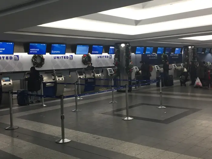
Here we can see that upon entering the building, there is very little distance from the door to the check-in counter. When a crowd begins to build up at check-in, there isn’t much space for people to efficiently queue up, and people will be crushed up against the back wall near the doors. Besides this, notice that the lighting is poor and the ceilings are low. This creates a depressing atmosphere. Traveling can be a stressful situation in general, and airport designs should be created to help alleviate some of the stress or at least create a relaxing environment. Take a look at the new check-in area:
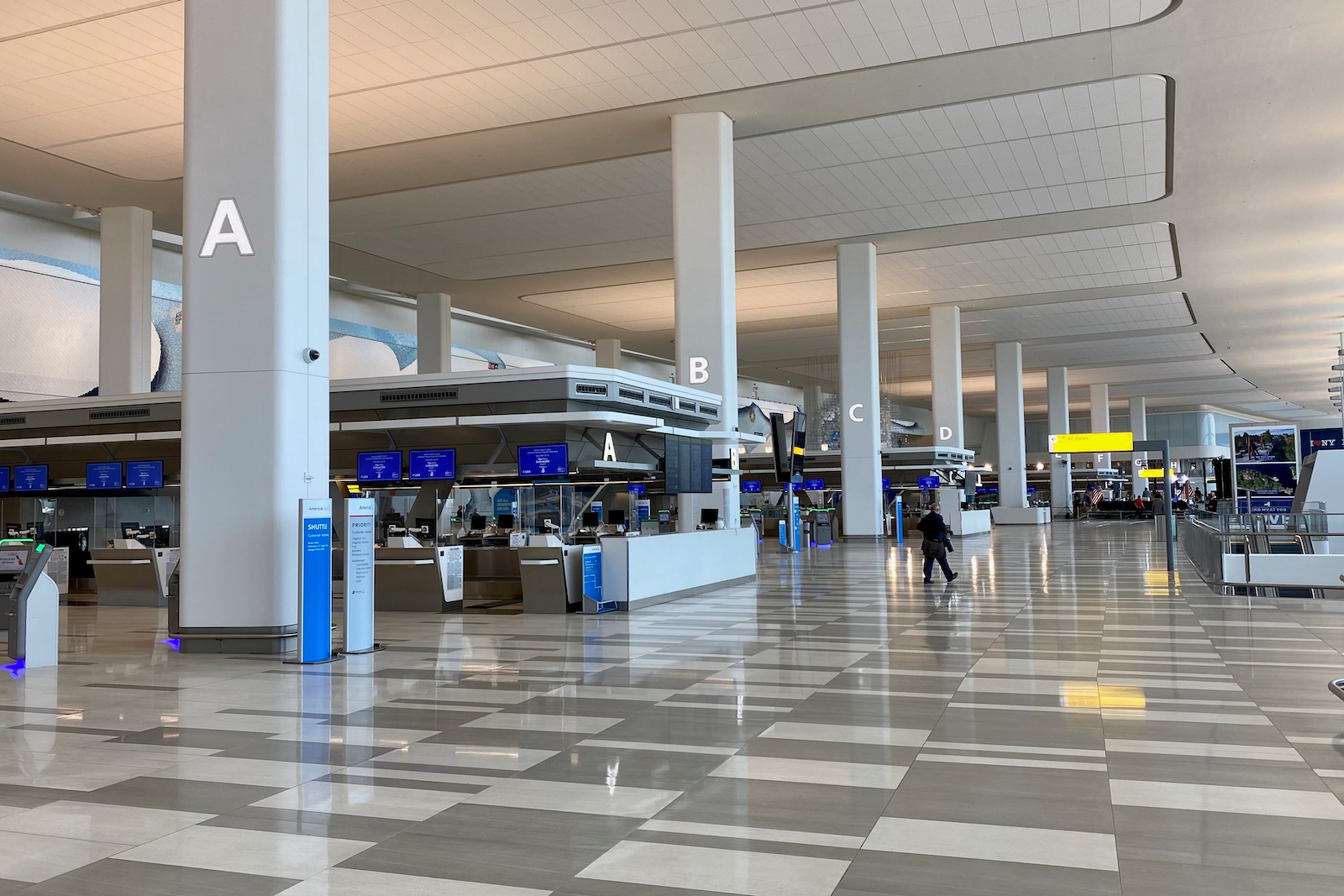
The improvement is stark. Notice how the check-in counters are now perpendicular to the doors, which solves the previously stated problem. Between each “island” of counters there are self check-in kiosks which can help speed up the flow of passengers, especially for those who don’t need to use the counters. The floors are clean and shiny, the ceilings are high, and the lighting is more natural.
After check-in, passengers will usually then move on to security. Take a look at the old security area:

As you can see, people are once again hit with low ceilings and crowds. In addition, the whole area is sloped downwards, which causes rollerbags to slide away from people who let go of them. Now take a look at the new security area:
Notice the natural lighting from the large windows past the security area, high ceilings, and carpeting. The new terminal has a central security area that serves all gates, reducing the possibility for confusion as everyone must go to the same place. The carpeting is another measure that serves to calm the nerves of travellers, as it creates a more warm and inviting feeling.
After leaving the security area, passengers are greeted with large floor-to-ceiling windows with ramp views, and a large area for passengers to reorganize their belongings. Allowing passengers to see the airplanes gives a sense of peace, as they can immediately see their final destination. These factors are subtle but help to create a smoother experience overall.
Finally, passengers will arrive at the gate area. Notice the old gates:
Again, we see the theme of bad lighting and low ceilings. Visually, we see a long, narrow hallway with an Auntie Annie’s on the right and a gate area on the left. Huge problems arise when people are waiting to board their flights. The gate areas in the old terminal were not designed large enough to accommodate all passengers who need to board that particular flight. As a result, people will begin to overflow into the hallway and neighboring gates. The people lining up at the Auntie Annie’s will want to line up perpendicular to the counter, which will create a blockade that prevents people from passing them and continuing in the airport. And let’s not even start with that ugly sign. Now take a look at the new terminal:
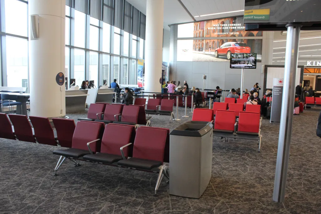
Again, we can see high ceilings, carpeting, and large windows. The colored upholstery on the chairs adds visual interest, and the seating arrangement lends itself well to social distancing. Overall, the new gate area has a sense of flow which seems to naturally direct passengers to where they need to go. The new terminal includes another second-floor seating area which gives more space for passengers who may have extended wait times or would like to overlook the rest of the terminal.
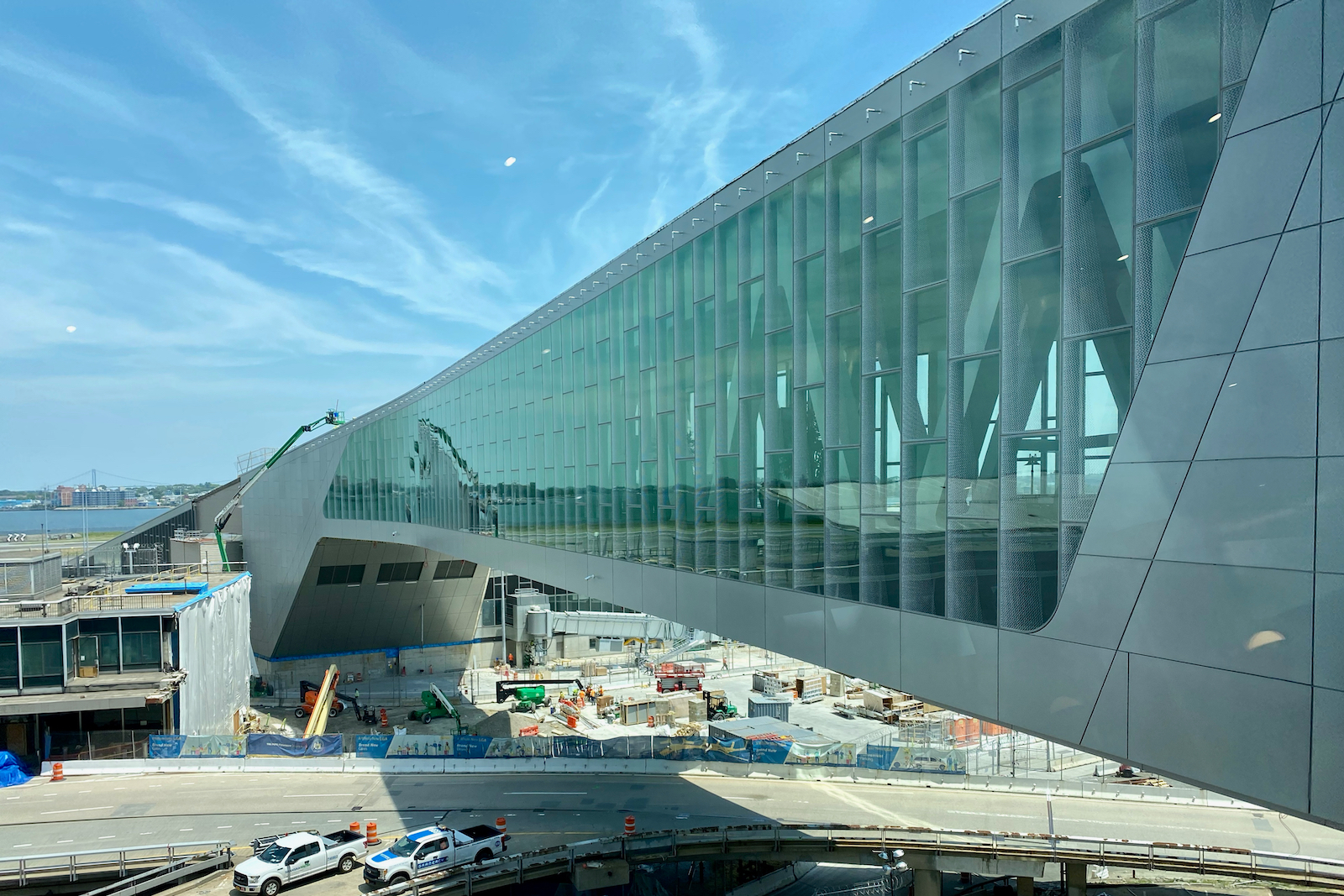
As previously stated, improvements airside are difficult to come by, but another taxiway will be added under a pedestrian bridge, which will help to slightly alleviate congestion of aircraft.
Overall, the new design of LaGuardia Airport shows many improvements especially in atmosphere and passenger experience. The project is expected to be completed in 2021 and costs around $4 billion.
Sources:
https://www.planestats.com/aptot_2016mar
Photos by WSJ, Business Insider, and The Points Guy
No comments:
Post a Comment